Tweet Flow - Crossover Review with Bird House Rules
A while back, I did a review of Twitter along with the help of my friend and Twitter maven, Tee Morris. Well, now we're back to do it again. This time we're looking at Twitter clients. Specifically, clients for the iPad. Last time it was an interview. Now we have another special treat. This review is the first of a series of crossovers with Tee's Bird House Rules podcast. So along with each review you also get a chance to listen to Tee and I talk about each client in a special episode of Bird Bird House Rules. The content is different, so be sure to take time to listen to the audio in addition to reading this review.
And first up is Tweet Flow. Note that this is Tweet Flow for the iPad written by Presslite (www.presslite.com), not TweetFlow written by Darragh Moriarty for the iPhone, which is completely different and not covered here.. You'll know you've got the right one because Tweet Flow is free from the App store. Tweet Flow is a simple, basic, no frills client for Twitter that manages to be elegant in its simplicity. This is a great client for an iPad owner starting out with Twitter.
Tweet Flow only handles one Twitter account, but if that is all you have, it delivers reliable service. So, let's take a look. When you open Tweet Flow for the first time, it greets you with the following settings screen.
And as far as settings go, this is it. Pretty much nothing else. Enter your Twitter logon and password, and decide if you want sounds or not. We'll come back to what "Classic scroll" means in a bit. Touch Save, and you're off.
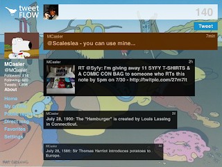
One of the features of Tweet Flow is the way it displays the tweets. The most recent tweets are displayed at the top, with older tweets spaced down underneath it, getting smaller as they are older. You can scroll up and down through this list, and the tweets will get larger as they move to the top of the screen. If you go back to Settings and turn on Classic Scroll, all the tweets will show at the same size as the top tweet. But where is the fun in that?
Edit: This made it into the podcast, but somehow I left it out of the review. Tweet Flow auto-updates your tweets every three minutes. There is no manual update, there is no setting to adjust it. It is hard-coded. There is, however, a way you can trick Tweet Flow into updating early. When you change screens, Tweet Flow re-loads the tweets for that screen. And it even works if you change to the screen that you're already on. So if you want to refresh your Home screen, just tap Home, or tap the Tweet Flow logo in the Upper Left and wait while it reloads. The downside to this three minute update is that sometimes the update will catch you in the middle of doing something. This has caused me to loose a tweet being composed, and some other unpredictable things depending on which screen I was on. Nothing majorly problematic, just quirky. And now, back to the review, already in progress.
Since there isn't much to see in Tweet Flow, it is easy to give you a quick tour. You've seen the Home screen, and before that, the Settings screen, so let's just work on down the list and check out the My Profile screen next.
Here on your profile page you've got a large version of your Twitter avatar, and some stats on your account. Your tweets are shown in a green background, just as they are in the regular tweetstream. This handy color coding helps you keep track of things in the main screen. You'll also notice the background has changed. Tweet Flow downloads the background from your Twitter profile and displays it as the page's background, although with a slight greenish tint. My profile background is a bit more yellow. Next stop, Public replies.
This page features replies from other people back to you. Also known as @mentions. These are color coded brown and also show up as brown in the main tweetstream. So far very consistent and predictable.
The Direct msg screen shows you your private direct messages from other Twitter users. These have a simple white text on a black background like the regular tweetstream. And the Favorites screen is much the same, except that it displays the tweets that you've previously marked as Favorites. So let's jump back the Home screen and dig a little deeper this time.
One thing you may notice is Tweet Flow's default background, with the sky and the clouds. This display actually changes during the day. I took these screen shots in the morning, so it shows the sun low to the ground. As the day progresses, the sun rises. When it becomes night, the sun turns into a moon! It is like they built a clock into the background.
Tap in the white bar at the top of the screen and the keyboard appears and you can type in your tweet. Tap the Tweet button in the top right corner to send it on its way. The Done button on the keyboard is a little deceptive, as it doesn't send the tweet, as you might expect, but instead makes the keyboard go away. Just a little quirk.
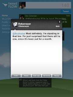
If you tap on one of the tweets in your stream, you get a pop-up window that looks like this.
You can tap on the white area to select all or part of the tweet, which can be useful for quoting or ReTweeting. The buttons along the bottom of the pop up give you access to the other basic functions: The Profile of the author, ReTweeting the tweet, making a Public reply, adding to your favorites, or sending a Direct Message to the author. Tap on the Profile button, or the name bar at the top of the window and you'll be taken to the profile of the person who wrote the tweet you were looking at.
This looks much like the screen for your profile. Again, the background from the person's Twitter page is downloaded and displayed as the screen's background. Just this time without the colored tint. If the person is using the default background, it uses Tweet Flow's own default background. Unfortunately, there isn't a way to go from this back to the original tweet you were on.
You'll notice that the second tweet on this screen has a sizable image in it. This is another nifty feature of Tweet Flow. When someone tweets a link to an image on Twitpic or one of the other image services for Twitter, it displays a thumbnail of the image. Tap the tweet to see the detail, and again, you'll see the thumbnail.
If the tweet actually contains links to multiple images, you'll see each of the thumbnails that will fit in the space. Now, you'd think that if you tapped on the thumbnail, you'd be taken to a large version of the picture. But it doesn't work like that. You have to tap on the link to open it in an internal browser.
This is a real browser. you can click links and dig down as far as you'd like. Buttons at the top will let you go back and forth, or just close the browser and return to your twitter stream.
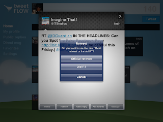
Tap on a tweet, and try the ReTweet button this time. You'll be greeted by a pop-up window asking which style of ReTweet you want to use.
The old ReTweet will put the text in your tweet bar and pop up the keyboard so you can add your own comment to the ReTweet in the space that is left. The official ReTweet will add the selected tweet to your stream so your followers can see it.
Public Reply will put the person's name in your tweet bar and let you type your reply. Message brings up a separate message window so you can send a Direct Message. Add Favorite will put the selected Tweet into your Favorites, but oddly enough, there is no way to remove a Favorite from your list. Possibly an oversight?
And that is pretty much it for Tweet Flow. The only thing really left to mention is that it works in Portrait mode as well as Landscape mode.
Tweet Flow is a good, basic Twitter client. It is elegant in its simplicity. If this is the kind of thing you're looking for on your iPad, it is worth giving a look. And it is worth giving a listen to the Crossover episode of Bird House Rules and finding out what Tee and I had to say about Tweet Flow. Or go ahead and subscribe to Bird House Rules. But come back in two weeks to see the next client we'll be looking at.
Bird House Rules - Episode #12: Review of Tweet Flow (with Nifty Tech Blog) [16:06m]: Download


0 comments:
Post a Comment